Graphs
Probe Schedule® is very strong on graphically displaying data. All data that is collected can be displayed on a graph in one way or another. Combinations of graphs are used to provide deeper insight and understanding of the data.
Below are 7 examples of the many different types of graphs that can be created by Probe Schedule®
with just the click of a button!
Root zone average graph:

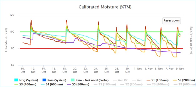
Seperate levels graph:
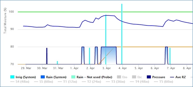
Continuous logging probe data with pressure switch:
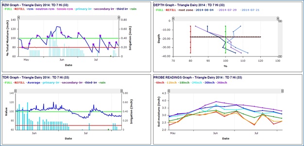
Combined graphs:
Water budget graph:
Below is an example of a neutron probe graph and below that, a combination of electronic probes:
